RDC Brand Design
- Art Direction
- Design Systems
- Digital Design
- Print Design
- Decks & Presentations
- Marketing Materials
- Motion Graphics
- Web Design & Development
- Events & Tradeshows
- Content Creation
- Brand Collaborations
Project Description
The refresh drove a 25% increase in conversion rate and attracted partnerships with high-profile global clients such as Gucci, Nike, Tesla, Rivian, Erewhon, Equinox, Whole Foods, and other industry leaders.

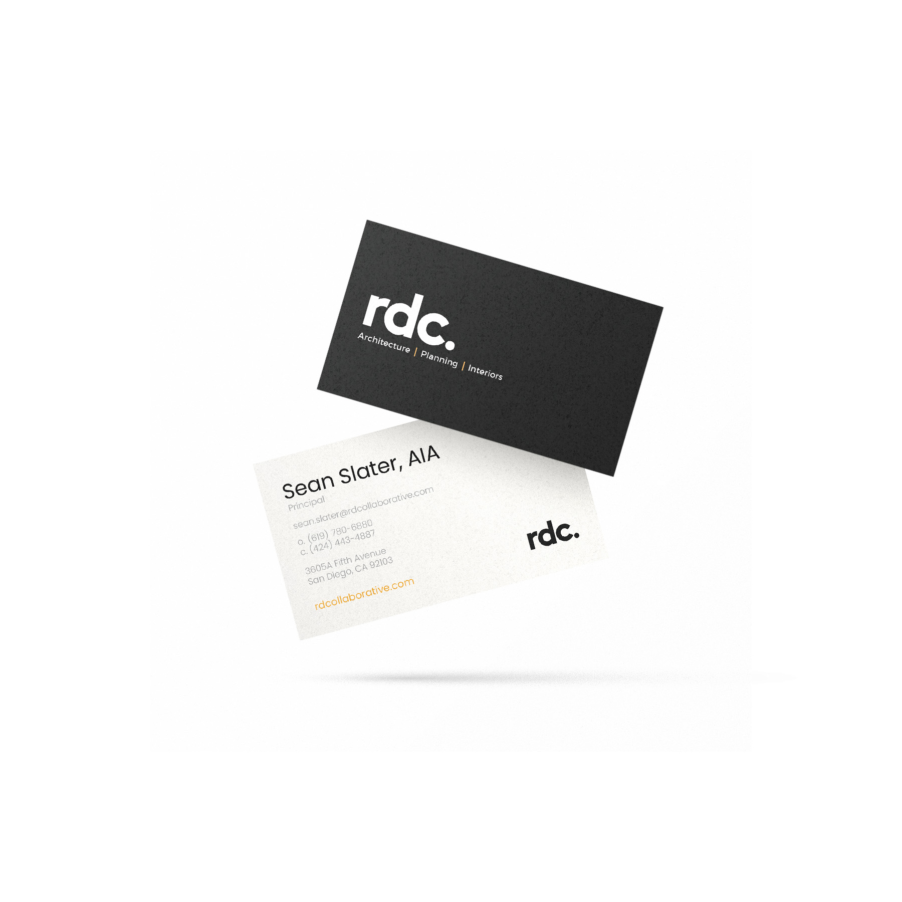
Brand Website

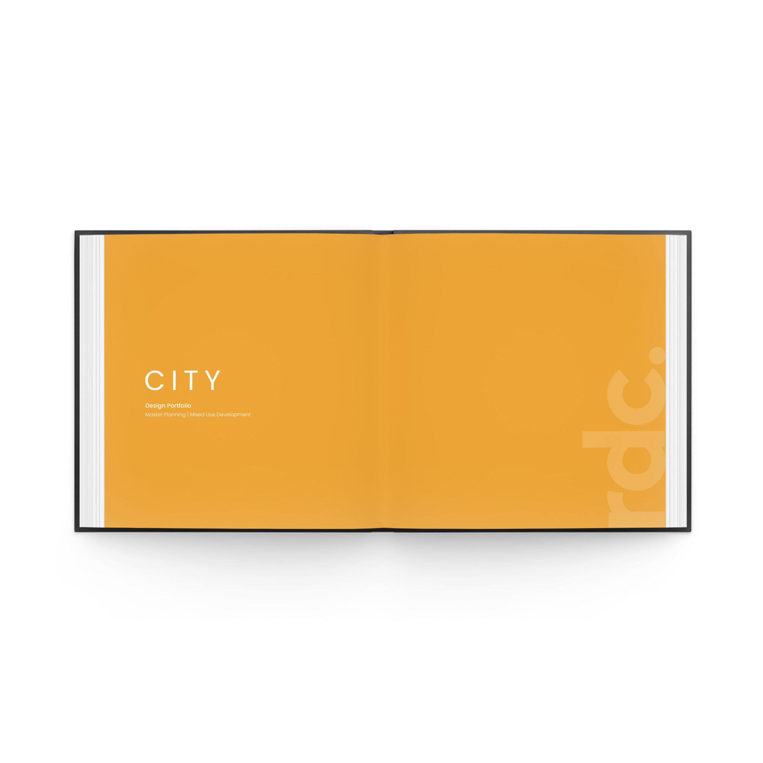
Proposal & Qualifications Packages

Proposal & Qualifications Packages

Select Slides from Brand Deck
Custom Iconography
Design Process
Problem
RDC’s existing brand identity lacked cohesion and modern appeal, which hindered its ability to resonate with contemporary clients and convey its position as an industry leader.
Solution
Directed a comprehensive refresh of RDC’s brand identity, modernizing its visual language to better reflect the company’s innovative approach and expertise. This involved developing scalable design systems, creating versatile client-facing assets, and crafting an elevated digital presence through a strategically designed website.
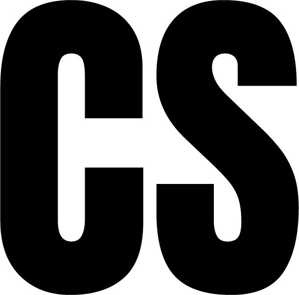
Before | Logo History
After | Refreshed Logo
Logo Refresh & Visual Identity
- Preserved the brand’s recognizability while modernizing its aesthetic.
- Developed a scalable visual system.
Scalable Design Systems
- Built a robust design system that streamlined asset creation across marketing, communications, social, and design teams.
- Created templates for RFPs, decks, and marketing materials to ensure consistency and efficiency.
Digital Experience Overhaul
- Designed a website with intuitive navigation and engaging interactivity to communicate RDC’s values effectively.
- Introduced subtle animations and storytelling elements to elevate the user experience.
Cross-Team Collaboration
- Worked closely with stakeholders to ensure the refreshed identity aligned with business objectives.
- Presented and defended design decisions to senior leadership, ensuring strategic alignment.

Before | Pre-Refresh Palette

After | Refreshed Palette

Before | Pre-Refresh Proposal Design

After | Refreshed Proposals and Qualifications
Takeaways
Results
- 25% increase in conversion rate, driven by a cohesive and professional brand presence.
- Secured partnerships with global leaders, including Gucci, Nike, Rivian, Equinox, and many others as listed below.
- Developed scalable design systems and automated workflows, integrating data and design to cut turnaround times by 40%.


